Graphics on the web currently play one of the most important roles, and design is the first thing your potential customers notice. It is, therefore, necessary to create a pleasant and, above all, easy-to-use interface in which they will easily navigate and will not be in the dark. Here’s a summary of the rules to follow if your goal is to design a successful website (and if you don’t want to unnecessarily burn your own money for further subsequent adjustments).
1) Complete style guide for the web:
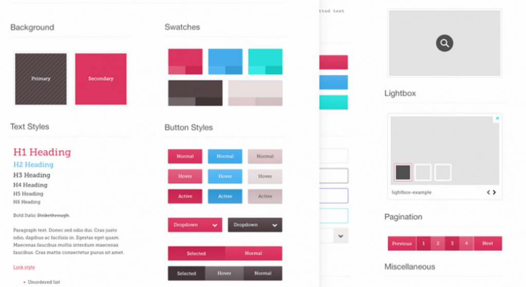
Each site, whether simple or complex, contains several (even dozens) of different types of different pages. And because the business to which the site relates often evolves, you need to edit and update the site itself. And believe me, even a few weeks after its launch, you will not carry in your head where what element is used and how it behaves, whether it is consistent with brand identity, etc. All this should be summed up by a document called a style guide (such a small holy grail for coders and for a graphic designer who takes over someone’s work :-)).
This document should contain at least the following elements:
Logo – the logo should ideally be vector and also available in square format (for favicon) – or at least have backgrounds from which to create a favicon.
Font – style guide must also contain all font styles and font source so that you can download it and not have to search for it for a long time (here you will appreciate tools like Invision, which can already create directly the bases for the encoder, where fonts, font sizes, line spacing are defined). Fonts are divided into paid and unpaid. I recommend using those that can be downloaded from Google Fonts – they are free and there is no risk of any s tug-of-no kind over licenses, etc.)
Headings and Sub-headings – have defined sizes h1 to h6 (this is most often forgotten especially for content sites where you need to have content structured to make it clear where the section/sub-section falls).
Regular text – You need to define size, including line spacing.
Other forms of text — such as quotes, sources at the end of an article, etc. Just any text element that is different from regular text. Here I would also include what the element should look like on the mobile and how it should behave (if it differs from the desktop).
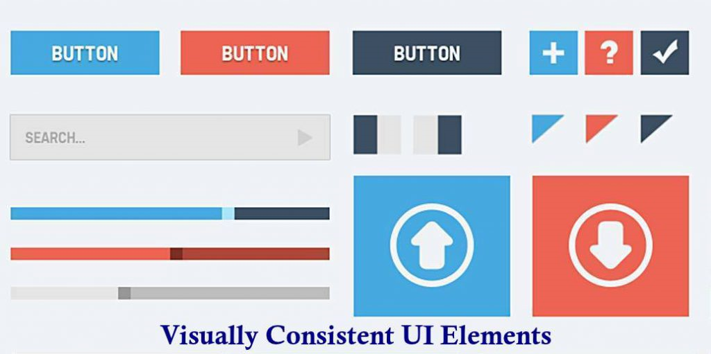
Numbered/unnumbered lists – in HTML code <ul> / <ol> (unordered / ordered list = numbered or unnumbered bullets in text), it is necessary to visualize in the style guide what individual sub-levels (1.1, 1.2, etc.) should look like and how their formatting will look. Again – this is often forgotten and it is often solved only when someone remembers that they want to use bullets on the blog, for example, to make the text clearer, and the text suddenly looks different, somewhere you want to use other elements (links, pictures, etc.) in the numbered list, and again the encoder needs a clear input on how to catch a cold. Therefore, you need to think about this from the beginning and dig into the graphics to define the visual appearance of all numbered and unnumbered lists in the style guide. See below what such a numbered list might look like – here it’s also “spiced up” with plus/minus click buttons.
Links – whether they will be underlined, how each state will behave (default, hover, active), some links are then less/more important, therefore their color combination /visibility may also vary.
Buttons (all states) – otherwise the buttons to be used for conversion action (submitting the form) will behave and look different, otherwise serving as a navigation element (buttons back, show more, etc.). Again, you need to define what the default state will look like, how when you hover over the mouse, etc.)
Tables – especially important for content sites, where you want to show a similar output as from Excel, you need to define in a style guide, for example, if you want to highlight a cell or row compared to others (something like conditional formatting in Excel), or if you want to have cell/column/row labels colored, for example, and how to make it clearer.
Colors – you need to define a list of colors used (verify sufficient contrast to the background, for example, according to WCAG 2.0, beware of using unnecessarily many similar colors), to determine suitable complementary colors, for example, you can use the Paletton.com tool.
Appearance of forms – you need to have designed visuals for forms as well, including individual states (error messages, successful submission of the form).
Icons – it’s ideal to have all the icons recorded/designed in a style guide to your website or have links to sets of icons that have been used (again, avoid unwanted and lengthy searches on your own when needed). Otherwise, you can also have icons created, but it is the more expensive option.
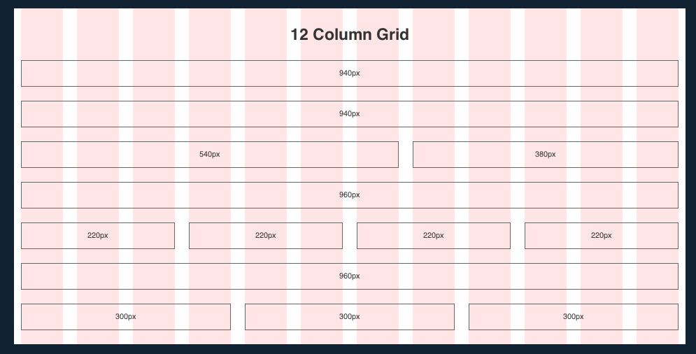
2) Start with the grid
Most sites work with vertical layouts, but they only work in certain cases. The grid serves coders and ensures that everything stays in place even after encoding the graphic — so that the site simply looks like the graphic designer drew it in the graphic design. Therefore, designing a grid should start designing for each site. The grid also helps align objects and increase clarity, and is a guide for the encoder where to place which element, etc. Bootstrap grid is most commonly used, working with 12 columns that are 30 pixels apart.
However, this does not end with the design of the grid, because you also need to be careful about the spacing between each column. All spaces should be the same, otherwise, the site looks confused. Luckily, bootstrap has a Spacing stand that offers preset gaps between columns or allows you to create your own.
3) Don’t be afraid to repeat individual elements
Elements that repeat themselves in graphic design are naturally appealing to users – or – when they have already encountered the element on the site, they will feel a little more at home on the site. On the contrary, the problem is when each page/screen behaves and looks different – the user has to get used to everything again, research and test how what works, which increases the time they have to spend on the page and it’s also a bit frustrating.
Therefore, elements that remain the same on all pages of the website must no longer be missing in the basic design of the website (in the so-called wireframe). Of course, you can (and do not) include any exceptions in the wireframe, but be aware that with each additional difference, the encoding time increases and increases the confusion/complexity of the entire site. It is important to work with components when creating a site, which are blocks that have the same foundation but can be changed arbitrarily. Repetition of elements is common today because it is beneficial for both users and web providers.
Each block has a different content, but it is one and the same element that is repeated.
4) Be consistent
The layout of the site must make sense to the user at first glance because otherwise, they feel frustrated (they must always be on their toes and, in fact, constantly touch and test everything).
Imagine you’re in a big office building that has one long straight hallway full of doors and you’re supposed to run it in the fastest possible time. The first door opens inwards, the second outwards, the next one goes side by side. Once they are lucky, the second time they open automatically at the push of a button, the third time only by gently pressing the handle. Now, take it you still have the same hallway in the next building that’s still full of doors, but they all open the same way. Which corridor do you think you’ll take faster and why?
Communicate with him nonverbally, based on colors and shapes, so that his movement on the web unfolds intuitively without much thought. Because no one wants to think long – and neither do you because they can come up with a corner that you didn’t count on, or just give up all the research on your website because “it’s too complicated” at the moment.
For example, if you use a round button on the main page and replace it with an arrow on the next page, it’s confusing for the customer. Anyone who comes to your website should have no problem orienting themselves here, otherwise, the experience of your website will put them off and they usually leave.
The amount of information we have to process in a day is increasing, the internet is becoming more overwhelmed, and thus our desire to spend time somewhere where someone is holding us up or even robbing us of our precious time is decreasing. The more we have to deal with, think about on the web, the decreases our satisfaction. Now imagine that I have to buy something from you and have to toil with your website for 10 minutes. At the end of the whole process (buying, 41/2 years old), I probably won’t have any super feeling, I’ll just be left feeling assured. You may have great goods, but that’s why I won’t enjoy them so much because my “user experience” just won’t be any :-).
For example, this might look consistent in the style guide.
5) Set optimal contrast
Contrast is a great tool to control the viewer’s attention. It helps highlight what you think is important and makes it easier for the user to navigate. It is a nonverbal way that allows not only to emphasize the information that the user should take away. In addition, it also arouses curiosity in the customer and implicates the story of your message.
I recommend using contrasts to highlight links, which you can also achieve by underlining them. However, also use contrast in common text, which must be easy to read and meet the WCAG 2.0 standard. At the same time, I do not fully recommend that you place a font smaller than 16 pixels on the site. It’s pretty hard to read.
Use contrast to control what a user remembers from your website or what catches their eye first.
6) Less is more
A study conducted by Microsoft in 2015 found that the range of our attention dropped to just 8 seconds (and continues to decrease).
For comparison, the aquarium fish will keep the attention for 9 seconds. It follows that the best online customers would be aquarium fish…
Your goal is to pass on as much information as possible to potential customers in the shortest possible time. Be aware that anything you add to a website distracts the user.
If a Web page contains too many elements, then important elements are lost. Therefore, every element placed on your site must be effective. This includes, for example, page numbering, which is often unnecessarily highlighted on the page, even though it does not carry any information about your product. Always ask yourself if what you place on the site will really interest your customer.
In the following example, we see unnecessarily much text that could be summarized /de-searched (use less text – or one larger headline and possibly explain the conditions in scrolling text or on the next page, for example).

Too many elements seem overwrite and chaotic at first glance.
7) Do not use more than two fonts
Two fonts are enough. If you want to use more, you must have a good reason.
A distinction must be made between the heel and heelless letters. The web standard is the heelless font for better readability on electronic devices. The font you have chosen should be easy to read even when displayed in a smaller size. In addition, fonts from a single font family should always appear on the web, a group of slices that are derived from a single typeface.
These “families” are therefore designed in advance so that the individual fonts match and complement each other.
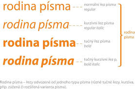
The font family includes several similar font types.
8) Mobile-first access
If you choose desktop first then whether and what grid you choose will affect how much time you spend editing views for mobile devices. As the number of smartphone users grows and their importance in the online (revenues made through mobile devices grow year on year in an e-commerce environment, both in the Czech Republic and around the world), it is necessary to think responsively and create a website that provides a unified design, but different views depending on the device.
The Mobile-first approach was created in response to desktop-only site design.
At present, it has its merits, since most users visit your website from a mobile device (search phase = getting initial information, and if the ordering process is simple, mobile devices can also be the main sales channel – but it really does differ from business to business).
For you, this means designing an interface from the smallest displays. The small display of the mobile device is space-limiting and therefore so often neglected when creating a website. However, designing your website’s graphics for a small display will help you understand what’s really important about the site, making the desktop version much easier for you to create.
If you don’t have the graphic design option for small devices, it’s all the more important for you to get content that you put on the site easily edited for low resolutions. Either shorten or rescheduled long text for mobile viewing so that the content appears correctly. In addition, any text on the mobile will look much longer than on the desktop, which may discourage the customer. See the example below, where we can see that there is not as much text on the mobile as on the computer, and the top bar with categories appears on the mobile menu.

In mobile view, we work with the fact that the user will scroll, the information is much more condensed, and it is necessary to adapt the design of the (desktop / responsive/mobile) website to this.
9) Create as variable content as possible
Count on the fact that from time to time you will want to change your site and variability, in this case, will save you a lot of time and money. For example, if a component has a fixed position on your site and you want to convert it to plain text, you will fail.
It is, therefore, necessary to think ahead.
The solution, in this case, is SVG (Scalable Vector Graphics) formats, which you can create in computer programs such as Inkscape. They can be used for creating icons, texts, animations, or logotypes and at the same time have a smaller data volume than bitmaps.
Below we see an example again. It will be difficult to change where the arrows and the text in the bubbles point, or you need the graphics to do so.
It’s always about thinking about how often and how quickly you need to change something on the page. Sometimes it’s just better and faster than slapping a link to an editor to just edit it on smaller sites directly in the code. But if finances allow, it’s better to have an editor for everything and keep in mind that the design must work even after you change something – or at least it should :-).
This is what an unprofitable front page might look like.
It is also taken into account during the design itself and the variant that the website will be further developed. And that it won’t be necessary for just one language. At that moment, the need for an editor and requirements for the graphics not to “break” immediately when I translate the text, which will be significantly longer / shorter in the resulting language. Multiply this by the number of language mutations and you will find that you can’t do without an editor and that changing the layout of the graphics every time is already quite expensive….
Also, adding other pages and their language versions to your website is expensive without variable content and in that case, you can’t do it without the help of graphics. Therefore, always think ahead when creating a design.
10) Compression of audiovisual elements
Everyone likes the pictures, everyone wants to have an interesting, colorful, different website and I don’t know what else :-).
But in order for it not only to look good but also to work properly and also for everything to load quickly on all devices, it is necessary to have images of good quality.
This means having high-quality photos that you can reduce and still look good.
The high quality of bitmap resources will ensure that you can export them in double, ideally triple resolution. When exporting, always try to compress as little as possible, because you only optimize the final image size depending on the speed of the website. When encoding, such a high resolution will be useful for you, because the visual elements can also be adapted to retina displays.
You must not forget the retina of the display. The easiest way to adapt your website for such displays is to create a single image that you place on the website so that it is displayed to all devices, whether they have a retina display or not. However, retina displays have almost twice the resolution, which means that a photo you place on the web for a retina display will contain 4x more pixels, which rapidly increases its data volume and is unnecessarily large for display on a mobile phone. The solution, in this case, is to use elements generated by HTML and CSS, so that you do not have to prepare several different versions of images.
JPEG is the most recommended format for the web precisely because it allows compression without significant loss of quality. However, if you do not upload photos directly to your website, but some graphics, the PNG format will be more suitable for you, which can also be replaced by the already mentioned SVG. Other formats such as AVIF or WEBP are generated automatically.
PNG enables lossless compression in raster graphics and is used for small icons or smaller images (the difference between PNG and JPG for a full-screen banner may take a few MB, which you want the user to always have to download each time their site is loaded ). Therefore, it is necessary to think a lot about the resulting compression.
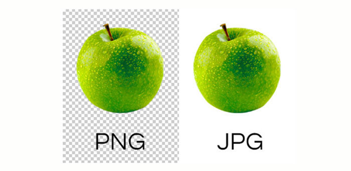
Unlike JPG, PNG format supports transparency.
I think I’ve mentioned this here several times, but you can use tools to check out what could be optimized on the site (not just from the point of view of compressing audiovisual files) tools can be used:
However, it is necessary to be able to use the tools or to be able to interpret the data correctly from here (for example, to understand that GTMetrix in the free version often takes a server from Canada, i.e. ping will not be so terrible that the goal is not to achieve a score of 100 / 100 but to determine the vulnerabilities and the ones that I can fix /optimize, so fix /improve and possibly make a benchmark of other similarly focused websites determine where you want to get to with what metrics and whether it is even realistic with regard to your financial capabilities or the elements used on the site that you urgently need (advertising systems, other third party software). But I took a little detour :-).
Different component variants require images that will be exported in the same size and viewport as in the graphics design. If you are working with a slider on the site (that is, you have multiple images that alternate), then we must export the images for the same dimensions so that the slider behaves the same when clicking, etc.
At the same time, if you use image trimmings in graphics, leave it to the encoder and export the image classically in square format. The image will then be much easier to edit through the editorial system to achieve a smaller image size. Transferring a mask to code opens up new possibilities for you, and you can create different transformations and effects.

Note that the crop method affects the resulting image size on the web.
What your site can compromise more than large images is video. Therefore, always think carefully about placing it on the site.
Why post a video to the web:
- One short video sometimes explains the whole issue better, faster, and more efficiently than a ton of text.
- You are distinguished/ connected to some form of communication (typically advertising).
- Interactive, more personal (someone speaks to you in your language and most often there is a person of flesh and blood behind it = it is more trustworthy), and so on…
There would be a number of reasons to have a video on the web. But why not, have you tried to think about it?
Why not place the video on the web:
- This is a large file that slows down the site (and it does a lot), it can be solved, for example, by not loading the entire video immediately when loading the site, but only after the user interacts (it clicks on the video because it wants to play it, at that moment you are tightening the data necessary to play the video, but it does not happen every page-load of the site, Google and users will thank you for it – and so much :-)).
- Compression reduces video quality – if you’ve ever watched a poor-quality video stream, you know what we’re talking about – you only see some blurry suckers, similarly, bad video compression can happen.
- Mobile devices may have a problem playing the video — a suitable video player, slow connection, etc. are missing.
The main drawback of the video is the slowdown of the site that it carries with it since it is much larger than the photo. For this reason, compress the video correctly before placement to make sure that this does not significantly degrade the image quality and the loading of the site itself.

The best thing for your website is if the video only launches after the user interacts.
For mobile devices, you need to adjust the video settings, as they may often have trouble playing it, and slowing down websites may have more impact. Depending on your settings, the video may not appear at all on mobile devices or will only start after the viewer interacts, so the site doesn’t slow down unnecessarily. Fewer worries will provide you with good old static objects, however, a quality video that will captivate the viewer will keep it on your site for a few minutes, which is a considerable advantage.
11) Use invisible elements
Invisible elements on pages take your site to the next level.
It is a function that allows you to “unpack the menu”, display help, or describe something in more detail.
All this after simply hovering over an invisible button. Their use is probably neglected because it serves mostly users who visit the site from their computer. So, choose to use this tool depending on how your target group visits the site. However, it is definitely appropriate to at least consider the use of invisible elements, since it is a tool that will again facilitate orientation and will be appreciated by more demanding users.
An example of using an invisible button.
12) The website must display on all monitors in the same way
Each user comes to your site from a different device, and desktops often have display mismatches. Your website must look the same on a high- and low-resolution monitor. Therefore, when encoding, count on the resolution of the site from 320 pixels without a fixed upper limit, because it is currently different. Avoid risky elements that adapt poorly to display size even in normal resolution.
13) Create icons and logos vector-based
Vector icons are again related to variability because they can stretch when displayed at a higher resolution.
The best thing about SVG icons is the format. If you don’t have a vector format, try to get it online.
I definitely recommend looking at what photobanks offer before creating custom icons, which provide sets of icons at bargain prices. Icontail, Iconsolid, and Shuttershock are probably the best known, where you can get individual sets for a few dollars. If necessary, just contact the graphic designer to prepare some specific missing icons for you.
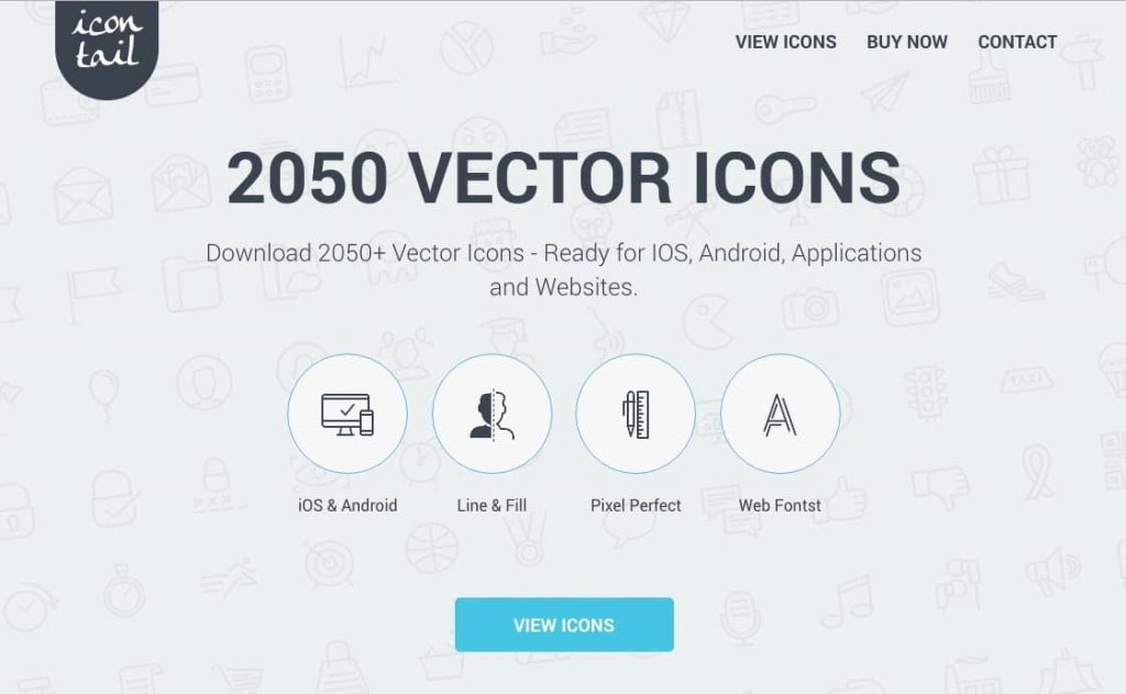
Icontail’s home page.
14) Be careful with animations
Placing an animation on the web is useful only if it saves the user time.
Your creativity in creating a website must not limit your customers’ goals. Some sources report that the animation should take no more than half a second. If you fit into this time and your animation is expedient, you will certainly make a good impression, but the same as I mentioned above applies – all in moderation.
Animation must make it easier for the user to achieve their goals and must not delay them.
15) Do not unnecessarily encourage action
Some buttons in their appearance encourage users to take action, but nothing happens the moment they click on them.
Therefore, clearly distinguish between interactive buttons so that the customer recognizes them at a glance and, most importantly, as I mentioned above – so that the elements on the site always behave the same way.
The graphics that are important to you (cart transitions, etc.) must be sufficiently distinctive. To make it clear to the user where he can click and most importantly – to intuitively do it himself when it is necessary (he decided to buy it).
Oftentimes, you don’t even realize that your site is confusing in this regard. Fortunately, where your customer’s click can be easily evaluated using UX audit/heatmap/focus group, etc. There are plenty of variants, just want to and be interested in your website.
The behavior of users on the web/ internet is also gradually changing, so the old know-how to test, test, and then test are still valid. And to evaluate – this is a popular pastime especially in corporations – we collect data, but we do nothing about it (or we do not even know where we have it, but the main thing is that “we collect it”).
Some users may think of clicking on a white round circle because they may think it is a button.
Finally, ask questions, find out
Just try to get as close to your customers as possible and be interested in what they would like to see on the site. Questionnaires will help you with this. Those from Google Docs or Survio are accessible. The questions you choose in the questionnaire will affect how much time you spend evaluating, so choose closed questions (A, B, C) instead so that the answers you get are easily quantified (and easily evaluated).
Regularly evaluate traffic, for which Google Analytics are the best. It’s important to measure conversions and pay attention to how your site’s visitors behave, how much time they spend on your site on average, and how many percent of visits lead to some other action. The time window in this case is completely individual.
If 5 customers visit your site daily, this is not a sample that represents anything. Always wait for the number of customers, which is more significant. Visitor statistics will reveal what needs to be improved.
It’s all in the details that will differentiate you from the competition and save you a lot of money as a result. If you’re placing something on a site, always have a good reason. Finally, remember to place a privacy text page on the site when creating graphics, something that every website must already have today, and otherwise you might get into trouble. It’s easy to create additionally if you have a site header linked to your content.
I wish you good luck creating your website.
And if you don’t know what to do with it, write it down, maybe we can arrange a consultation. Source : Krcmic.com
- Business
- invisible web
- Internet marketing
- animation for beginners
- what is style guide
- web animation
- fonts
- bootstrap
- png format
- chart
- Graphics
- web graphics
- free graphics on the
- how to use web
- how to make a website
- how to create web pages
- contrast
- contrast web
- creative web graphics
- media graphics
- grid
- designing for web graphics
- invisible elements of
- png to jpg
- png x jpg
- graphics rules
- accessible site rules
- rules for graphics
- rules for creating a website
- webdesign rules
- accessibility of websites
- raster graphics
- retina display
- scripture family
- jpg
- png
- style guide
- style guide what is
- svg
- svg format
- svg to
- creating an animation
- creating a website
- variable content of
- variable content website
- vector graphics
- visual order of
- web cheap graphics
- Webdesign
- web accessibility
- basic graphics rules
- Webdesign
- Business
- bootstrap
- png x jpg
- style guide
- svg formát
- svg
Currently, we have around 5681 calculators, conversion tables and usefull online tools and software features for students, teaching and teachers, designers and simply for everyone.
You can find at this page financial calculators, mortgage calculators, calculators for loans, calculators for auto loan and lease calculators, interest calculators, payment calculators, retirement calculators, amortization calculators, investment calculators, inflation calculators, finance calculators, income tax calculators, compound interest calculators, salary calculator, interest rate calculator, sales tax calculator, fitness & health calculators, bmi calculator, calorie calculators, body fat calculator, bmr calculator, ideal weight calculator, pace calculator, pregnancy calculator, pregnancy conception calculator, due date calculator, math calculators, scientific calculator, fraction calculator, percentage calculators, random number generator, triangle calculator, standard deviation calculator, other calculators, age calculator, date calculator, time calculator, hours calculator, gpa calculator, grade calculator, concrete calculator, subnet calculator, password generator conversion calculator and many other tools and for text editing and formating, downloading videos from Facebok (we built one of the most famous Facebook video downloader online tools). We also provide you online downloanders for YouTube, Linkedin, Instagram, Twitter, Snapchat, TikTok and other social media sites (please note we does not host any videos on its servers. All videos that you download are downloaded from Facebook's, YouTube's, Linkedin's, Instagram's, Twitter's, Snapchat's, TikTok's CDNs. We also specialise on keyboard shortcuts, ALT codes for Mac, Windows and Linux and other usefull hints and tools (how to write emoji online etc.)
There are many very usefull online free tools and we would be happy if you share our page to others or send us any suggestions for other tools which will come on your mind. Also in case you find any of our tools that it does not work properly or need a better translation - please let us know. Our tools will make your life easier or simply help you to do your work or duties faster and in more effective way.
These below are the most commonly used by many users all over the world.
- Free online calculators and tools
- Time zones/Clocks/Dates calculators
- Free Online Units Conversion Calculators
- Free online web design tools
- Free online electricity & electronics tools
- Mathematics
- Online Tools
- Text Tools
- PDF Tools
- Code
- Ecology
- Others
- Free online downloaders for social media
- Marketing
- My PC / computer
- Keyboard Shortcuts
- Digital Marketing
- Cryptocurrency
- SEO
- Internet Business
- Website and UX Design
- Social Media
- Online communication
- IoT (Internet of Things)
- 200 Million+ Smart Speakers Have Been Sold But They Aren’t Yet a Marketing Channel. Why So?
- Business At a New Level: Connecting with Customers Using the Recently Updated Google My Business
- How Do Sessions Work in Google Analytics?
- How Google My Product Works?
- How To Do Local SEO for Businesses Without Physical Location in 2021
- Snapchat vs. TikTok: Complete Guide For Marketers
- The Most Common Design/Graphics Design Errors And How To Avoid Them
And we are still developing more. Our goal is to become the one-stop, go-to site for people who need to make quick calculations or who need to find quick answer for basic conversions.
Additionally, we believe the internet should be a source of free information. Therefore, all of our tools and services are completely free, with no registration required. We coded and developed each calculator individually and put each one through strict, comprehensive testing. However, please inform us if you notice even the slightest error – your input is extremely valuable to us. While most calculators on Justfreetools.com are designed to be universally applicable for worldwide usage, some are for specific countries only.